- Skip to SectionOverview
- Lesson Preview
- Teaching Materials
- Feedback
- Extensions
- Bonus Content
- Background
- Learning Standards
- Credits
- Acknowledgments
- Version Notes
- Overview
- Lesson Preview
- Teaching Materials
- Feedback
- Extensions
- Bonus Content
- Background
- Learning Standards
- Credits
- Acknowledgments
- Version Notes
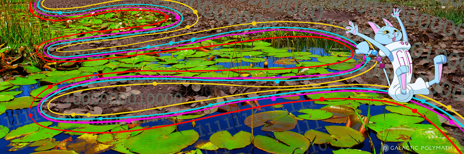
Data Streams
A crash course in data literacy using stream ecology

Sponsored by:
The Gist:
Level-up data literacy skills by practicing the "PPSTT" Framework for unlocking any graph's secrets. Students watch scientists model this approach & then try it on their own using multiple data types, including: the frequency of certain words in books, streamflow rates, and maps.
Target Subject:
Grades:
Estimated Time:
Target Subject:
ScienceGrades:
9-12Estimated Time:
2 x 45 min classes

Subject breakdown by standard alignments
Hook(s):
- Playing around with Google Ngram Viewer: a free online database for exploring the frequency of words in millions of books over time.
- Solving a mystery with multiple streams of data.
Keywords:
data literacyclimate changeecologyngramPPSTTwaterDataStreams unit trailer
A quick overview of all this unit has to offer!
PPSTT…the secret to reading graphs like a scientist #dataliteracy 📈
Introduces the PPSTT framework for data literacy. Sets up Lesson 1, where students will practice with a free database online.
How To Read a Graph Like a Scientist
3 Ecologists show us how they make sense of a graph they've never seen. Supports students' own exploration of the exact same graph in Lesson 2!


3 x 45 min
Available Grade Bands
Available Teaching Environments
Learning Objectives
Students will be able to...
Use a protocol to analyze the information in a graph.
Apply the PPSTT data literacy framework to a novel analysis of data using the Google Ngram Viewer.
Explain how the scale of a graph can be manipulated to show different trends.
Materials for Grades 9-12
Presentation (Lesson 1)
Need: WiFi, Computer, Projector, Sound
- For teachers guides, sign in with a free account!
Teacher Worksheet (Lesson 1)
Print 1
Student Worksheet (Lesson 1)
Print 1 Per Student
Steps & Flow
10 min: PPSTT Overview: Watch Video
10 min: PPSTT Overview: Watch Video
1.Engage: Read a graph about ghosts
Engage: Read a graph about ghosts
1.Engage: Read a graph about ghosts
Engage: Read a graph about ghosts
Student start to fill out the PPSTT details on their worksheets.
- Cherry picking: selecting specific data to tell a different story than is told by all the data
Have students fill in the details of PPSTT on their worksheet while watching the video. It may be helpful to pause, watch it twice, or poll the class for answers. There will be additional opportunities to add PPSTT details as the presentation unfolds.
5 min: Discovering Patterns
5 min: Discovering Patterns
2.Explore: Finding patterns in graphs
Explore: Finding patterns in graphs
2.Explore: Finding patterns in graphs
Explore: Finding patterns in graphs
Students find patterns in a graph in the presentation from Google Ngram Viewer .
Students or teacher uses Google Ngram Viewer to make a graph relevant to their interests.
- Patterns: repeated shapes, data points, or missing data in a graph
- Trend Line: line indicating the general direction or location of a set of data points
- Ngram: a sequence of ‘n’ consecutive items in a text
Students can do their own Ngram graphs if you have 1:1 technology or you can do a graph as a class. Emphasize school appropriate words.
10 min: What do the prompts tell us?
10 min: What do the prompts tell us?
3.Explore: What frames a graph? Prompts
Explore: What frames a graph? Prompts
3.Explore: What frames a graph? Prompts
Explore: What frames a graph? Prompts
Students explore all the elements that "frame" a graph, including title, x and y-axis labels, units, scale, source of the data.
Students focus on what prompts are present and how they add to the story of the graph.
- Prompt: for this unit, a prompt means anything that describes or "frames" the data in the graph, ex. title, x and y axis labels, units, etc.
- Annotate: add notes to something that describe or comment on the main content
Students annotate their Ngram graphs on the worksheet made in the previous step explaining what the prompts tell them.
4.Explore: Looking for the odd and unusual features on graphs
Explore: Looking for the odd and unusual features on graphs
4.Explore: Looking for the odd and unusual features on graphs
Explore: Looking for the odd and unusual features on graphs
Students analyze the scale of the graph, context of the data, fit of lines in the video and presentation to discover how graphs can be deceiving.
Students consider what can be strange about a graph: outliers, limited scales, missing data, anything that does not fit into patterns or trends.
- Strange: for this unit is something on a graph that is odd, unusual, or deceiving.
Students annotate their Ngram graphs on the worksheet with what might be strange or deceiving.
5 min: What's the story?
5 min: What's the story?
5.Explain: What is our takeaway?
Explain: What is our takeaway?
5.Explain: What is our takeaway?
Explain: What is our takeaway?
Students summarize what they learned from analyzing a graph.
Students discuss what claims a graph can support and what claims cannot be supported.
- Takeaway: the story the graph tells, what we learn from reading the graph
Students annotate their Ngram graphs with a summary of what is important.
5 min: Let's Talk about Trust
5 min: Let's Talk about Trust
6.Elaborate: Can we trust this graph?
Elaborate: Can we trust this graph?
6.Elaborate: Can we trust this graph?
Elaborate: Can we trust this graph?
Students ponder what makes a graph trustworthy or not.
Sources, the amount of data, the context, and additional questions are considered as students decide how much they should trust info in a graph.
- Trust: how reliable the information in a graph is considering the source of the data, the amount of data, how it was collected and the context it is presented in
Students annotate their Ngram graph with details about how trustworkthy it is.
5 min: Claim, Evidence, Reasoning
5 min: Claim, Evidence, Reasoning
7.Evaluate: Support your story
Evaluate: Support your story
7.Evaluate: Support your story
Evaluate: Support your story
Students use the claim, evidence, reasoning methods to explain what aspects of a graph are trustworthy.
After working through the PPSTT steps students make a claim about their graph, support their claim with evidence drawn from the graph, and connect their evidence to their claim with reasoing.
Students may need some coaching on the CER process. Choose one Ngram graph as an example and work through it with the class.
5 min: Detecting Deception
5 min: Detecting Deception
8.Extend: How can we apply the PPSTT framework to our lives?
Extend: How can we apply the PPSTT framework to our lives?
8.Extend: How can we apply the PPSTT framework to our lives?
Extend: How can we apply the PPSTT framework to our lives?
Students complete an exit ticket explaining whether they think that graphs can be used to deceive people.
Students use what they have learned about how evaluate a graph and explain whether they think graphs can be used to deceive people.
- Deceive: intentionally misrepresent data to lead people believe something that is not supported by the evidence
You may want to review the 1980 - 2015 graphs that was on many of the slides and the 1800 - 2020 graph that included science to show students how context can be manipulated to tell a different story.
Going Further
Ideas and resources for deepening learning on this topic.
Google Ngram Viewer
Type words in and see how frequently that word appears in books published from 1500 to present
DataWISE
A tool that scaffolds key science practices and media literacy skills to guide students in critical analysis of data-based claims. Developed by NCSE (the National Center for Science Education).
Spurious Correlations
Correlation is not causation; graphs that show correlation between unrelated data sources; fun for students!
Slow Reveal Graphs
Check out this amazing site for complementary strategies and examples for helping your students explore data with the PPSTT framework.
I^2: Identify and Interpret
I Can Use the Identify and Interpret (I2) Strategy
FLICC: Techniques of Science Denial
An explanation of techniques that science deniers use to confuse and obscure science.
The BS Machines
For age-appropriate classrooms. This is a free, very accessibly written online textbook about what AI Chatbots like ChatGPT are and are not. Very eye-opening, but aimed at undergrads.
Learning Objectives
Students will be able to...
Analyze streamflow data to recognize patterns and differences that raise further questions.
Synthesize information presented as a graph, table, photo, and map to fill in gaps in the data.
Make a claim based on the evidence from several data sources about whether a stream is wet or not.
Materials for Grades 9-12
Presentation (Lesson 2)
Need: WiFi, Computer, Projector, Sound
- For teachers guides, sign in with a free account!
Teacher Worksheet (Lesson 2)
Print 1
Student Handout (Lesson 2)
Print class set
- For teachers guides, sign in with a free account!
Teacher Handout (Lesson 2)
Print 1
Student Worksheet (Lesson 2)
Print 1 Per Student
Steps & Flow
10 min: Review the PPSTT method
10 min: Review the PPSTT method
1.Engage: Which graph is more honest?
Engage: Which graph is more honest?
1.Engage: Which graph is more honest?
Engage: Which graph is more honest?
Students engage in a class discussion about which graph represents data more honestly.
Students compare graphs from Lesson 1 with short time scales to a graph that shows a much longer time scale and make claims about what graph is more honest.
There are no correct answers to the questions on the first few slides about the Ngram graphs. The purpose of the introductory activity is to get students thinking about how data can be used in different ways to tell different stories.
10 min: Just the Graph
10 min: Just the Graph
2.Explore: Finding patterns in stream flow graphs
Explore: Finding patterns in stream flow graphs
2.Explore: Finding patterns in stream flow graphs
Explore: Finding patterns in stream flow graphs
Students practice finding patterns in a graph without a title, units, axis labels, or a source to focus on finding pattern in the graph.
Students watch scientists find patterns on the graphs they just worked on in the video.
- streamflow: amount of water moving through a stream at a specified time period, measured in this unit in Liters/second.
If students are struggling to find patterns in the streamflow graph on their worksheet, you may want to play the video of scientists finding patterns first to scaffold their success.
15 min: Where does it flow?
15 min: Where does it flow?
3.Explain: Solve a data mystery using the PPSTT process
Explain: Solve a data mystery using the PPSTT process
3.Explain: Solve a data mystery using the PPSTT process
Explain: Solve a data mystery using the PPSTT process
Students use streamflow graphs, streamflow tables, photographs, and a map to match the data to the location where it was collected.
Students review the prompts, strange, takeaway and trust steps they learned in Lesson 1 while matching 5 graphs to the locations where the data was collected. Students use a table, a map, and photos to gather additional clues.
Long Term Ecological Research station (LTER)=a location receiving public funds from NSF to monitor biological process, species diversity, and climate over decades to help predict future changes to ecosystems
Students may want to focus on getting the correct answer; however, the worksheet is focused on having them explain how they know their answer is correct. Example statements are provided for the first location. Students can copy this format for other locations or you can create your own answer template.
10 min: Are streams wet?
10 min: Are streams wet?
4.Elaborate: Support your claims with evidence
Elaborate: Support your claims with evidence
4.Elaborate: Support your claims with evidence
Elaborate: Support your claims with evidence
Students use their data handout and what they have learned in class discussion to answer higher-level thinking questions about how data tells a story and wether they should believe their data stories.
Students answer the unit question, "Are streams wet?" By reviewing the data, specifically the graph showing all 5 streams, and finding evidence that supports their answer. They also consider what other information they would need to tell a more complete story about the five sites in the data mystery.
- perennial: a body of water that has some water in it all year
- intermittent: a body of water that may go dry for part of the year
Help students conclude that just three years of data is not enough to observe long term trends.
Going Further
Ideas and resources for deepening learning on this topic.
Look up stream data from your area!
The USGS Watershed Mapping Interface shows all sorts of ongoing science, organized by region in the US.
Understanding long-term changes to global ecosystems
An overview of NSF's LTER sites for monitoring ecological patterns over decades.
Slow Reveal Graphs
Check out this amazing site for complementary strategies and examples for helping your students explore data with the PPSTT framework.
Long Term Ecological Monitoring Sites
Have students find the nearest LTER. More information on the sites across the US where the streamflow data was collected and the photos taken. LTER sites are long term monitoring sites for climate change. Info on individual LTER sites are in the speaker notes on the slides.
Shocking Research: Over Half of the World’s Rivers Cease to Flow for at Least One Day a Year
Have students read the press release about the Messager et al. 2021 Nature paper to understand the broader reason why fluctuations in streamflow are important at a global scale.
Golden Gate Weather Services
Have students think about how larger climatic patterns affect annual flow rates. Information on the severity of La Nina and El Nino cycles in each year since 1990.
The BS Machines
For age-appropriate classrooms. This is a free, very accessibly written online textbook about what AI Chatbots like ChatGPT are and are not. Very eye-opening, but aimed at undergrads.
Materials for Grades 9-12
Data Streams Digital Assessment
Digital form for pre/post test assessment. See printable teacher version for evaluation guidance.
- For teachers guides, sign in with a free account!
Printable Assessment (TEACHER KEY)
Printable assessment
Printable Assessment (STUDENT)
Printable assessment
Please let us know how it went with your class!
We want to know what you (and/or your students) think!
Share your feedback in < 5 min with these forms:
PPSTT Cheat Sheet Handout
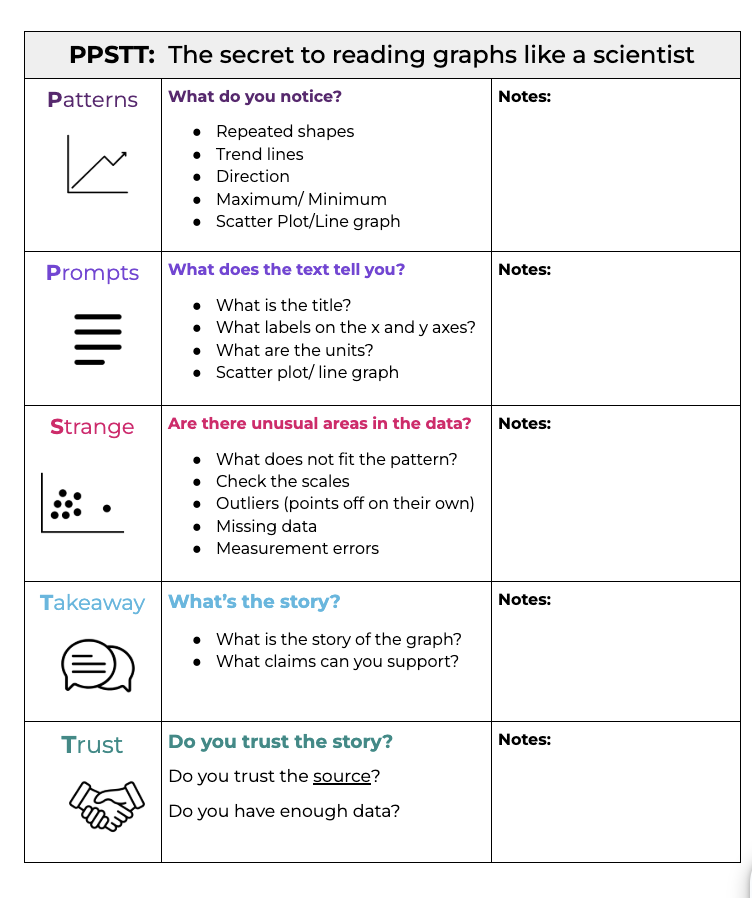 Use this graphic organizer to help guide students with analysis of any graph, figure, or data visual.
Connection to Research
This unit is sponsored by Dr. Tom Luhring's Aquatic Ecology Lab at Wichita State University. The first two lessons foster student data literacy while introducing students to the broader themes of the research presented in Lesson 3. In Lesson 1, students will learn the PPSTT framework, which teaches students how to analyze graphs and figures. In Lesson 2, students will use real data sets from Long Term Ecological Research Sites (LTERs) and analyze graphs on stream flow. In Lesson 3, students will apply the approaches they learned in Lesson 1 and 2 to Dr. Luhring's work on Kansas streams.
Research Background
Dr. Tom Luhring's lab primarily investigates the legacy of droughts for aquatic systems. His students look at how key players in aquatic systems (microscopic life, fish, amphibians) respond to the return of water following droughts and ultimately determine how ecosystems recover. Dr. Luhring's lab combines lab experiments, field experiments and long-term field-based studies to approach ecological questions.
Further Reading:
Popular Press
- Slate | The Language Time Machine: Google’s Ngram Viewer gave us a new way to explore history, but has it led to any real discoveries?
- Yale Insights | The Digital Tool That Helps Robert Shiller Understand the Past -Sci Tech Daily | Shocking Research: Over Half of the World’s Rivers Cease to Flow for at Least One Day a Year
Scientific Papers
- Aquatic Systems of the Wichita State University Biological Field Station: Youngmeyer Ranch, Elk County, Kansas
- No free refills: Prior drying and vertebrate colonisation alter ecological functioning and vertebrate fitness within experimental aquatic systems
- Droughts Reduce Growth Rates and Increase Vulnerability to Increasingly Frequent and Severe Drying Events in an Aquatic Ectotherm
Target Standard(s)
Dimension: Science & Engineering Practices
How does the lesson address this standard?
When analyzing multiple data sets, students will form questions about the Patterns, Prompts and Strangeness to better understand what the data means.
How does the lesson address this standard?
Graphs and tables provide specific evidence for students to cite to support claims and conclusions.
How does the lesson address this standard?
Students will analyze mutliple streamflow data sets, including graphs, tables, and photographs to determine a mystery city.
How does the lesson address this standard?
Students will evaluate the story of a graph in the Takeaway step of the PPSTT framework.
Dimension: Cross-Cutting Concepts
How does the lesson address this standard?
Students will arrive at their Takeaway by observing a data set with varying data ranges and key words. Changing the timeline and adding in other key words can lead to changing the Takeaway and Trust of the graph.
How does the lesson address this standard?
Students will arrive at their Takeaway by observing a data set with varying data ranges. Changing the timeline of the graph will show different Patterns that were not previously seen. This can lead to different Takeaways.
Connected Standard(s)
Dimension: Number Systems, Operations & Abstract Representation
How does the lesson address this standard?
In the Prompts step of the PPSTT framework, students determine the units on the graph, and how those units influence how the graph is read.
Dimension: Language, Speaking & Listening
How does the lesson address this standard?
Students will construct evidence-based responses, and engage in class discussions on the credibility of data sets.
How does the lesson address this standard?
Through the use of graphs, tables, and photos, students will draw conclusions supported by specific evidence.
Dimension: Science & Engineering Practices
How does the lesson address this standard?
Through the use of graphs, tables, and photos, students will draw conclusions supported by specific evidence.
Matt Wilkins | Oversaw development of all materials; scripted, storyboarded, and directed videos
Beth Robelia | Created initial draft learning materials and produced videos
Stephanie Castillo | Edited, narrated, featured in, and scored supporting videos
Laura Perry | Added feedback and significant revisions to all learning materials
Shania Burkhead | Provided feedback and guidance throughout the unit
Ethan Oltean | Provided feedback and guidance throughout the unit
Tom Luhring | Defined outreach goals; provided feedback throughout development; provided scientific validation of lesson content; featured in videos
Funding
This outreach was funded by NSF CAREER Award 2338165 to Tom Luhring
Illustrator
Created original artwork for unit banner, lesson tiles, and video assets
- Anna Wilkins | Atlanta, GA
Featured Scientist
Starred in video for Lesson 2
- Molly Russell | MS Student, Wichita State University Wichita, KS
- Parker Binns | MS Student, Wichita State University Wichita, KS
GIS Consultant
Provided flow rate and mapping data for LTER sites featured in lesson 2.
- Mary Marek-Spartz | Information Manager, Minneapolis-St. Paul LTER St. Paul, MN
Major Release Beta
0.1.0 Unit initialized
August 20, 2024
0.2.0 Major overhaul, preparing for public release
March 5, 2025
Major Release 1
1.0.0 Updated L2 materials and acknowledgments.
March 24, 2025
1.1.0 Fixed duplication issue. Finalized teacher handout for L2.
March 25, 2025