- Skip to SectionOverview
- Lesson Preview
- Teaching Materials
- Feedback
- Bonus Content
- Background
- Standards
- Credits
- Acknowledgments
- Overview
- Lesson Preview
- Teaching Materials
- Feedback
- Bonus Content
- Background
- Standards
- Credits
- Acknowledgments
Females singing to be heard
Challenging long-held assumptions about birdsong through data visualization

Sponsored by:
The Gist:
Students will learn how data visuals tell a story. They will analyze real bird song data to try to understand why female singing behavior has been overlooked in one of the most common birds in the world. They will also gain a deeper insight into the scientific peer review process.
Target Subject:
Grades:
Estimated Time:
Target Subject:
MathGrades:
5–8 & 9–12Estimated Time:


Subject breakdown by standard alignments
Driving Question(s):
What is the best way to visualize data?
Essential Question(s):
- How do our assumptions (biases) affect our conclusions?
- What are the pros and cons of scatterplots vs. histograms?
Hook(s):
This lesson focuses a lot on puzzles called ciphers and uses a goofy video showing connections between histograms and dot plots to engage students.
Keywords:
animal communicationbarn swallowsbirdsdata literacydot plotshistogramspeer reviewscatter plotssonggritLesson Trailer: "Females Singing to be Heard"
A brief overview of the lesson, providing broader context from two authors of the study this lesson is based on.
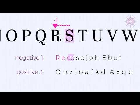
How to solve the Polymath Puzzle from the "Females Sing" lesson
Explains strategies for solving the Polymath Puzzle. This is an engagement hook that blends a simple alphabetic shift puzzle with a data literacy challenge.
How to read the deciphered scatter plot
Provides scaffolding for understanding how to read this graph (which comes straight from a recent study) and notice patterns.
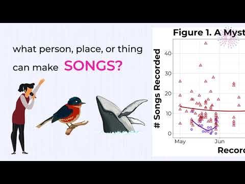
Polymath Puzzle Reveal—Is the graph about birds, spiders, whales,...?
Explains what this graph is actually about, providing background on female song in barn swallows and the field work employed to study it.
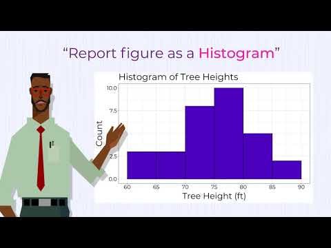
Scatter plots or histograms? Why data visualization is important
Highlights the vital importance of data literacy. It asks students to think critically about the pros and cons of scatter plots and histograms.
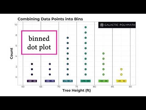
Connections between dot plots and histograms (with sound)
Show logical connections between a dot plot, a binned dot plot, and a histogram. The silly sounds are added for memorability.
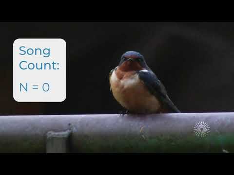
Getting to know your data: Counting barn swallow songs
This video demonstrates how to count barn swallow songs to generate the data examined.
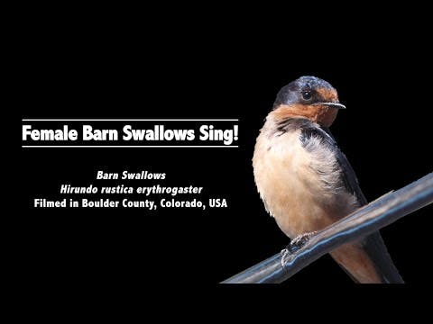
Scientific Background: Female barn swallows sing
This video is not included in the lesson, but is provided for your background or if you want to use it in some way.
3 x 45 min
Lesson 2 may go a bit faster than the lessons 1 and 3.
Available Grade Bands
Available Teaching Environments
Materials for 5-8
Presentation (Part 1)
Need: WiFi, Computer, Projector, Sound
- For teachers guides, sign in with a free account!
Teacher Worksheet (Part 1)
Print 1
Student Worksheet (Part 1)
Print 1 Per Student
Steps & Flow
15 min: Engage
15 min: Engage
1.Introduction to Ciphers
Introduction to Ciphers
1.Introduction to Ciphers
Introduction to Ciphers
Students learn how to crack a type of secret message called a cipher.
By spending some time introducing students to ciphers, we are building computational think and laying the groundwork for cipher-based puzzle hooks for each part of this lesson. The Polymath Puzzle in Part 1 draws students into decoding the labels on a graph in order to engage them in trying to understand the next level of meaning in the graph, creating a rich data literacy learning experience. In the first step, students learn that ciphers are used to make a secret message. We use a simple cipher called an alphabetic shift, where each letter of each word in a message has been shifted a certain number of places (e.g. +1 would mean A becomes B, B becomes C, and so on). This section works on assimilating new vocabulary, as well as encouraging students to have a growth mindset. They need to quickly orient themselves to the "system" of ciphers and how they work. Parts 2 and 3 of the lesson will build on this engagement hook.
- algorithm: a set of steps, like a mathematical recipe
- alphabetic shift: type of cipher where each letter has been shifted a certain number of places (dictated by the algorithm)
- cipher: a secret message that uses an algorithm to make a message seem like nonsense
- decipher: 1) to convert a secret message into readable text; 2) to succeed in understanding something
- encipher: convert readable text (plaintext) into a secret message
- plaintext: readable text (not a cipher)
Ask students to read slides and predict what the next slide will be (e.g. the next letter in the alphabetic shift). Model a growth mindset, and that it's ok to not completely understand at first.
2.Cipher Practice
Cipher Practice
2.Cipher Practice
Cipher Practice
Students practice determining an algorithm given plaintext (normal text) or a cipher.
In the remote version students provide responses digitally using Nearpod.*
All remote versions of GP lessons can be completed using a free Nearpod account.
3.The Polymath Puzzle
The Polymath Puzzle
3.The Polymath Puzzle
The Polymath Puzzle
Students use their new skills to decipher the coded axes of a scatter plot graph representing data from a real scientific study.
Decipher algorithms for grade bands:
- 5–8: (-1 shift)
- 9–12: (+3 shift)
Set a definite time limit (e.g. 5min) to solve and enter deciphered text, and move on. The videos will clear up any misunderstandings.
15 min: Explore
15 min: Explore
4.How to solve the cipher
How to solve the cipher
4.How to solve the cipher
How to solve the cipher
Students watch ▶ How to solve the Polymath Puzzle from the "Females Sing" lesson to scaffold student understanding.
Students will either discuss their strategies (in-person) or choose which strategy they adopted (remote).
5.What Does it Mean?
What Does it Mean?
5.What Does it Mean?
What Does it Mean?
Students watch ▶ How to read the deciphered scatter plot to scaffold understanding. Then they’ll discuss as a class.
Students share all their observations and wonderings about the graph. They then come up with their own educated guesses (hypotheses) for what the graph's story is. (i.e. What species is being studied? What patterns are shown? What was being studied?)
For the remote version, classroom discussion/ brainstorming is done with a Nearpod Collaboration Board. If doing student-paced lesson, this will need to be enabled.
Encourage any student observations or guesses at the graph's meaning, no matter how basic. Start with, what kind of data are on the X and Y axes? Which sex has the most songs per day? Are there any "weird" points (outliers) that stand out from the rest?
10 min: Explain
10 min: Explain
6.Mystery Reveal
Mystery Reveal
6.Mystery Reveal
Mystery Reveal
Students watch ▶ Polymath Puzzle Reveal—Is the graph about birds, spiders, whales,…?, which connects the puzzle to current research and data literacy.
7.Pivot to Histograms
Pivot to Histograms
7.Pivot to Histograms
Pivot to Histograms
Students learn about how the study’s original authors were questioned on their use of scatter plots vs histograms.
- data visualization: a representation of numbers or other types of data in a way that makes it easier to see patterns. Ex: scatter plots, histograms, & other types of graph
8.Choice of Data Visuals
Choice of Data Visuals
8.Choice of Data Visuals
Choice of Data Visuals
Students watch ▶ Scatter plots or histograms? Why data visualization is important, which connects scatter plots to histograms and pivots to Part 2 of this lesson.
Students are briefly introduced to the concept of peer review & learn about how scientists (& everyone) can disagree about the best way to represent data. Students are put into the shoes of the study's authors and over the next two sessions will learn what a histogram is, make the histogram with the real data, and determine whether the study reviewer was right in suggesting that a histogram would be better than a scatter plot to show this data. A key concept here is that understanding graphs is a type of literacy that gives us power.
5 min: Evaluate
5 min: Evaluate
9.Reflection
Reflection
9.Reflection
Reflection
Part 1 ends with a customizable reflection slide and review of covered vocabulary, and topics.
Reflection Ideas:
- What types of data have you seen represented as a scatter plot?
- Why do you think female barn swallow song has been ignored until 2020? (This will be a repeated theme.)
- 3-2-1: 3 things I learned today; 2 things I found especially interesting; 1 question I still have.
Materials for 5-8
Presentation (Part 2)
Need: WiFi, Computer, Projector, Sound
- For teachers guides, sign in with a free account!
Teacher Worksheet (Part 2)
Print 1
Student Worksheet (Part 2)
Print 1 Per Student
Steps & Flow
10 min: Warm Up Cipher
10 min: Warm Up Cipher
1.Engagement Hook
Engagement Hook
1.Engagement Hook
Engagement Hook
Students begin by solving an alphabetic shift.
“Cherry Trees” is a reference to the histogram example…leave it for students to notice.
5 min: Review
5 min: Review
15 min: Background for Understanding Histograms
15 min: Background for Understanding Histograms
3.Concept: Range
Concept: Range
3.Concept: Range
Concept: Range
Students learn new vocabulary. Then histogram is explained through a real world example of heights of cherry trees.
- analyzing: organizing and exploring data to unlock its meaning
- data visualization: a representation of numbers or other types of data in a way that makes it easier to see patterns. Ex: scatter plots, histograms, & other types of graph
- range: a set of two numbers: the least and the greatest number in a data set. Usually expressed as Small Number – Big Number
4.Concept: Dot Plot
Concept: Dot Plot
4.Concept: Dot Plot
Concept: Dot Plot
Students follow along as the presentation shows how the data is used to create a Dot Plot. Check-in formative assessments of understanding are built in.
- dot plot: a graph with one point for each data observation
- binned dot plot: a dot plot where observations have been binned into ranges
- histogram: a type of bar graph showing the distribution of a set of measurements for 1 variable. A common pattern (called a "normal distribution") is bell-shaped, with most observations having values close to the average, with about equal, increasingly rare measurements that are very high or very low. Human height is a good example of a normal distribution, with many "average/medium" height individuals, and very few individuals being significantly shorter or taller than all the rest.
- scatter plot: a graph showing the relationship between two continuous variables. Each data point represents the measurement for variable X and variable Y for a particular individual.
5.Concept: Binning
Concept: Binning
5.Concept: Binning
Concept: Binning
Students watch ▶ Connections between dot plots and histograms (with sound) and then follow along as the presentation shows how to bin the cherry tree data.
This video has some silly sound effects which will hopefully increase engagement and help students remember the connections between dot plots and histograms.
- binning: combining groups of observations into ranges. The bins could be ranges (like 0-5, 6-10, etc), or named categories, like when we classify people into “short,” “average,” and “tall” height categories.
10 min: Synthesis
10 min: Synthesis
6.Analyzing the Data
Analyzing the Data
6.Analyzing the Data
Analyzing the Data
While showing the completed histogram, presentation asks two questions prompting analysis and critical review of the graph.
5 min: Review & Reflection
5 min: Review & Reflection
7.Review
Review
7.Review
Review
A quick review of the steps just taken (find range, create dot plot, bin data, draw bars to create histogram) to prep students for Part 3.
8.Check-In
Check-In
8.Check-In
Check-In
Students are asked to match graphs to their names.
The end of Part 2 ends with a customizable reflection slide and review of covered vocabulary, and topics.
Part 3 is a bit longer, so if you have extra time, you may want to preview part of what's coming up tomorrow.
Materials for 5-8
Presentation (Part 3)
Need: WiFi, Computer, Projector, Sound
Table (Part 3)
- For teachers guides, sign in with a free account!
Teacher Worksheet (Part 3)
Print 1
Student Worksheet (Part 3)
Print 1 Per Student
Steps & Flow
5 min: Warm-Up & Review
5 min: Warm-Up & Review
1.Engagement Hook
Engagement Hook
1.Engagement Hook
Engagement Hook
Students warm up with a cipher.
They need to shift back 3 to decipher “FEMALES SING,” referring to the overlooked fact that females in many bird species sing, just less frequently than males.
Make sure to only spend a few minutes on the warm-up. This is a long lesson.
2.Review
Review
2.Review
Review
Students get reoriented to the driving question: Is a scatter plot the right way to show the data?
10 min: Getting to Know Your Data
10 min: Getting to Know Your Data
3.Understanding Table 1
Understanding Table 1
3.Understanding Table 1
Understanding Table 1
Students are guided through understanding what the data are and how they are categorized in Table 1.
This is the raw data, representing the number of songs recorded for each bird, along with their sex & ID code.
- binned data: summary data where measurements have been combined into bins (ranges)
- raw data: original, unmodified measurements
4.Connecting the Data to Reality
Connecting the Data to Reality
4.Connecting the Data to Reality
Connecting the Data to Reality
The ▶ Getting to know your data: Counting barn swallow songs video shows what barn swallow song sounds like and how songs were counted, to deepen connection to the data.
(It’s not said, but this is male song. Female song is not shown in this lesson because of a shortage of footage. See the bonus video for examples).
5.Check-In
Check-In
5.Check-In
Check-In
Students are reminded of how data points are plotted on a dot plot.
To check in they’re asked to draw the missing point (remote) or say how many songs the missing bird sang (in-person).
10 min: Mini-Review & Worked Example of How To Bin Data
10 min: Mini-Review & Worked Example of How To Bin Data
6.Synthesis
Synthesis
6.Synthesis
Synthesis
Presentation reviews the cherry tree height data from Part 2 to show how data organization affects the type of graph you can make. We want to bin the data in order to make a histogram to answer our driving question: Is a scatter plot or histogram better to visualize our song data?
7.Binning Data
Binning Data
7.Binning Data
Binning Data
Students are walked through what a “bin” is (a range of data points that get combined), and how this looks in table and graph form.
For G5-8 versions, male data is binned as an example. In G9-12, students have to bin both sexes, which are also coded as “one” and “two” in order to require a deeper understanding as the older students figure out which is male and female by comparing the two graphs.
5 min: Students Bin the Remaining Data
5 min: Students Bin the Remaining Data
8.Students Bin Data
Students Bin Data
8.Students Bin Data
Students Bin Data
Students fill out Table 2 by binning the raw data in Table 1. (All they have to do is count up the number of individual birds who sang a number of songs in a given range).
Students have the option of copying it down on scratch paper or downloading it as a word document (linked in the presentation). If using in-person version, the worksheet is provided.
It's important to set a hard time limit on this step, otherwise, it may eat up class time. You may consider doing the whole table as a class together, depending on your class's grade or motivation level.
5 min: Students draw a histogram from Table 2
5 min: Students draw a histogram from Table 2
9.Students Draw Histogram
Students Draw Histogram
9.Students Draw Histogram
Students Draw Histogram
Students use their binned data to create the histogram.
G5-8 students only need to make the female histogram. G9-12 make both (except for 2 example bins which are done as an example).
Again, make sure to provide a clear time limit on this step in order to finish.
10 min: Wrapping Up
10 min: Wrapping Up
10.Reflection
Reflection
10.Reflection
Reflection
Students are asked a set of reflection questions and should conclude that the scatter plot is a better visualization for this data set because: with the histogram, we lose out on the important detail that females only sing early in the spring.
Task: (G5-8) Draw the legend on the scatterplot from comparing to the male and female histograms or (G9-12) figure out the true sex of the coded “one” (female) and “two” (male) histograms from looking at the scatterplot with labeled sexes.
Key Take-Homes to Drive Toward During Reflection
- Female birds sing, and this has been neglected for decades, holding back scientific research into animal behavior
- 1 reason for this is the assumption/bias that females don’t sing. This is self-fulfilling, as females often look similar to males, sing much less in total & only sing early in the breeding season.
- This is a form of confirmation bias (though we don’t introduce that term), where we may latch onto evidence that confirms our preexisting assumptions.
- The scatter plot was a better visualization for this data because it shows the timing of song and when scientists need to focus study of female song to address this gap in our knowledge.
Got suggestions or feedback?
We want to know what you think with this short 3 min. survey:
What others had to say about this lesson:
Teachers
This is a fantastic lesson! I love how it combines actual research and allows the students the opportunity for analysis. I also love the fact that the peer review process is included in the explanation for the types of graphs used. This really allows students to see and understand the scientific process in action. Love it!!
Overall Rating: 5/5
Student Engagement: 4/5
Overall Learning: 5/5
Would Recommend to Other Teachers: 5/5
Student Level: Grade 8–Sarah Huneycutt, Homeschool Teacher in Nashville, TN
Students
I really enjoy this lesson! It is so engaging and fun!
–11th Grader in Nashville, TN
I think it looks like a very interactive lesson and it will hopefully be engaging and interesting to some students. It looks uncomplicated and it gives you all of the resources you will ever need for the lesson. The fact that it shows you how to create graphs and diagrams in the individual powerpoints is a good attribute in my opinion. -11th Grader in Savannah, GA
My biggest takeaway from the lesson was the importance of choosing the right way to display data…I don’t have any negative feedback…I really liked the lesson and appreciated how it was interactive and not just a lecture, like many of my online classes have become.
–11th Grader in Nashville, TN
For students who finish early/ want to explore on their own at home, there is a code hidden in the lesson title. Decoding it will require them to gain new tech skills. It also gives them a glimpse at a huge realm of knowledge (binary and hexadecimal encoding of data), though they don’t need to fully understand it to solve the problem.
At the end of the worksheet, students can optionally learn to translate a hexadecimal code into a web address. Hexadecimals (hex) are a system for encoding information in computers. Search for a “hex to text converter.” Translate the Task # on the front page to get a secret web link.
This is a fun “tech-savviness/independence” growth activity. Students are asked to dive into a complex topic (hexadecimal encoding/decoding of text) without much support. But it’s actually not that hard. The goal is to encourage all students to not shut down when something sounds complicated and to learn how to think creatively and use the power of the web to their benefit.
They should do a web search for “hex to text converter”
- The first hit is likely: http://www.unit-conversion.info/texttools/hexadecimal/, but almost any will work
- They have to type or cut and paste “6269742e6c792f6770686935” from the title page into the “Input Data” field
- Choose “Hex to Text” to decode (the example converter defaults to encoding Text to Hex)
- You “magically” get bit.ly/gphi5
- If the student then copies/types that web address into the address bar, it will result in:
Connection to Research
This lesson allows students to explore the actual data from the study and to hear from the study’s lead author to deepen data literacy and understanding of the scientific method. Students explore one of the primary figures in the study, a scatter plot (graph) showing different patterns of male and female singing output over the breeding season. Importantly, males sang much more than females and for a longer time (May-Aug, rather than just May). Thus, because males sing more frequently, if we assume (as has been common for birders and scientists until recently) that only males sing, your assumptions are reinforced more easily, because you are less likely to see a female sing.
During the peer review process, an anonymous scientist suggested that the scatter plot was not a good way to represent the data, instead suggesting that the authors should have displayed a histogram. In Parts 2 and 3 of the lesson, students aggregate (combine) the authentic study data in order to create a histogram. They must then interpret the data in both formats (deepening their understanding of how histograms and scatter plots relate to each other), and conclude which is a better way to demonstrate the study’s findings, explaining why.
For further reflection, students are then asked to synthesize what they have learned, along with new information presented to them. Why has female song been missed? Partially because of a pre-existing assumption that females don't sing, along with less common singing behavior in females. Why do females sing less? Because natural selection favors females who sing less. Females must sit on eggs for around 2 weeks, leaving them open to predation. If they were to sing as loudly and provocatively as males, they would attract predators which would eat them or their eggs, passing on no genes. Thus, natural selection has likely caused female song to be lost, simplified, or to be produced for short time periods during establishment of the breeding season in many species around the world.
Research Background
This lesson is based on a recent study that describes female song in barn swallows for the first time. Barn swallows are one of the most common birds in the world and have been the subject of more than 1000 studies, yet published birding field guides and scientific papers have all failed to describe female song or they describe it incorrectly as being the same as male song (females have their own song type). This is an important oversight, because research on male bird song has informed a lot of theory in biology about how populations evolve through mate choice and competition involving vocal communication, and how new species form.
Ignoring the sounds females make may result from inherent biases. Since bird song became an area of scientific study in the 1800s, it was almost exclusively researched by white males in the Northern Hemisphere. Since women have become welcomed into all areas of science, and research institutions have focused more intent study in tropical regions of the world, studies have discovered that female song is the ancestral state (i.e. the ancestor of all living song birds had both singing males and females). Moreover, female song has not been entirely lost in most species. As in the barn swallow, natural selection has favored females that sing less often, and to have more concise songs that are often restricted to the pre-egg-laying part of the breeding season. This drop in female singing after egg-laying is thought to stem from trying not to draw predators to nests. Due to lack of study, the full function of song in competition among females, male mate choice, or other functions is not well understood in most species.
Further Reading:
- Why We Didn't Know That Female Birds Sing: Two authors of the study this lesson is based on discuss its broader implications for society and K-12 education.
- Female birds sing. These biologists want you to listen. (features Drs. Karan Odom and Lauryn Benedict who worked on the study this lesson is based on).
- If you're getting paywalled, try clearing your cache or opening the article in an incognito window.
- Female bird song ignored by science, researchers say (features Dr. Karan Odom and Dr. Naomi Langmore, who was influential in shifting scientists' thinking about female song)
- Study reveals gender bias in bird song research and impact of women on science (features Dr. Karan Odom)
Target Standard(s)
Dimension:Measurement, Data, Probability & Statistics
How does the lesson address this standard?
- Students are given data represented in a scatter plot and are asked to identify and interpret the graph
How does the lesson address this standard?
Students use real data to construct a frequency table, then use the data to create and compare the results in a scatter plot and histogram.
Students evaluate the results of the two graphs, discuss how the two graphs provide similar and different information, and determine possible conditional probabilities with regard to female and male bird songs.
How does the lesson address this standard?
- Students create a histogram using raw data from a published research study
Connected Standard(s)
Dimension:Measurement, Data, Probability & Statistics
How does the lesson address this standard?
- Students are given data represented in a scatter plot and are asked to identify and interpret the graph
How does the lesson address this standard?
- Students create a histogram from raw data
How does the lesson address this standard?
- Students compare the data in a scatter plot and a histogram, then determine the differences between the two graphs
How does the lesson address this standard?
- Students are given data represented in a scatter plot and are asked to identify and interpret the graph
Dimension:Language, Speaking & Listening
How does the lesson address this standard?
- Students are taught the definitions of new words including: cipher, encipher, decipher, discern, algorithm, data visualization, dot plot, scatter plot, and histogram
- Students use and reference the new words throughout the lesson
How does the lesson address this standard?
- Students are asked to interpret, discuss, and draw conclusions from a scatter plot that was created from raw data in a real research study
How does the lesson address this standard?
- Students define, use, and reference new words including: cipher, encipher, decipher, discern, algorithm, data visualization, dot plot, scatter plot, and histogram
- Students use a real research article to read, interpret, and identify new/unknown words.
How does the lesson address this standard?
- Students evaluate quantitative information by comparing the same data in the form of a scatter plot and a histogram
Dimension:Reading
How does the lesson address this standard?
- Students are taught the definitions of new words including: cipher, encipher, decipher, discern, algorithm, data visualization, dot plot, scatter plot, and histogram
- Students use and reference the new words throughout the lesson
How does the lesson address this standard?
- Students practice making and reading a histogram from data provided in the lesson - Students make a histogram from data they collect on their own
How does the lesson address this standard?
- Students are asked to interpret, discuss, and draw conclusions from a scatter plot that was created from raw data in a real research study
Dimension:Science & Engineering Practices
How does the lesson address this standard?
- Students create and compare results of a scatter plot and histogram using real scientific data
How does the lesson address this standard?
- Students are asked to interpret, discuss, and draw conclusions from a scatter plot
- Students create a histogram using real data
- Students analyze and compare the results of scatter plots and histograms
How does the lesson address this standard?
- Students interpret a scatter plot based on real scientific data
- Students create a histogram using raw data - Students draw conclusions based on the scatter plots and histograms
How does the lesson address this standard?
- Students solve a series of ciphers using algorithms
- Students create their own algorithms and ciphers
How does the lesson address this standard?
- Students compare and contrast scatter plots and histograms created from empirical and self-generated data sets
- Students examine the results and interpret their findings
How does the lesson address this standard?
- Students use algorithms to solve a series of ciphers
- Students construct a histogram using raw data from a real research study, interpret the results, and describe the findings
Lead author and creative director:
Matt Wilkins, PhD
“I worked on this lesson for months, adapting my research into what will hopefully be a mind-expanding learning experience for pretty much all students, aged 11 and up! If you enjoy this lesson, please let us know–we want your feedback! This is the first of many, many Galactic Polymath lessons. Feel free to tag me (@mattwilkinsbio) and GP (@galacticPM) on Twitter with your experiences and student questions! And don’t forget to sign up for our mailing list to hear about what’s coming up next!”
Graphic Design Work:
Carver Lee, MA (csalt design co.)
Development of Learning Assessments and Standards Alignment:
Video production courtesy of:
Stephanie Castillo (aka Phuture Doctors)
Beta Testers
Teachers who trialed earlier versions of the lesson with their children or students
- Jennifer Gentry, PhD | Postdoc, Homeschool Teacher, Vanderbilt U, Collab for STEM Ed & Outreach Nashville, TN
- Sarah Huneycutt, PhD | Postdoc, Homeschool Teacher, Vanderbilt U, Collab for STEM Ed & Outreach Nashville, TN
Peer Reviewers
Instructional and subject experts who provided input or validation on content accuracy
- Greta Clinton-Selin | Education Program Coordinator, Vanderbilt U, Collab for STEM Ed & Outreach Nashville, TN
- David Gammon, PhD | Professor, Elon University Elon, NC
- Lauryn Benedict, PhD | Professor, University of Northern Colorado Greeley, CO
- Jeannie Long, PhD | Presidential PAEMST 2020 Award-Winning Science Teacher, Cleveland High School Cleveland, TN
- Greta Knudson MAT | STEAM Instructional Coach, Croft Middle School Nashville, TN


